
[PT]
Pensa em um desafio: reposicionar uma das marcas mais amadas do Brasil para fortalecer a conexão com seu público, atrair novos consumidores e traçar uma visão clara capaz de guiar sua evolução.
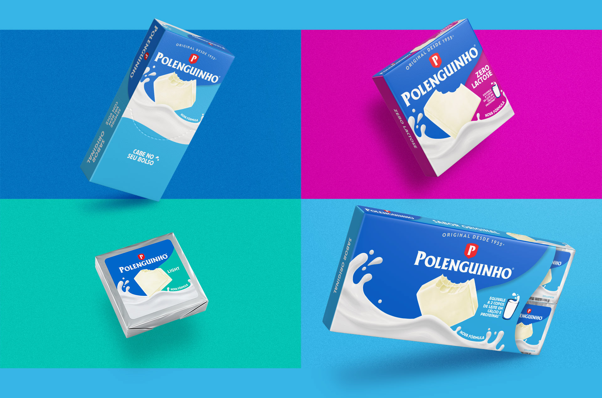
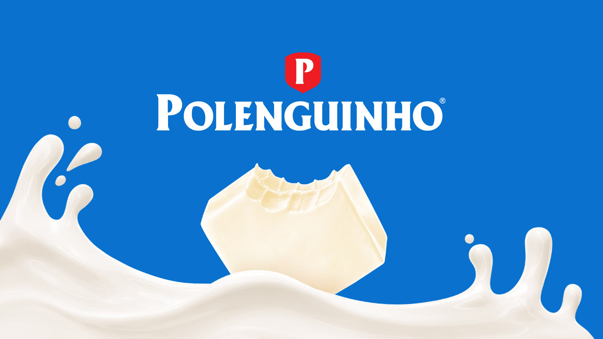
Após meses de imersão, criamos territórios - baseados nas necessidades dos consumidores e nos pilares da marca - que foram avaliados em pesquisa para chegar em um posicionamento poderoso e assertivo. “Sempre vai bem com você” é a nova essência da marca que destaca sua versatilidade e seu companheirismo único: Polenguinho vai com você aonde for e quando der vontade. É o afeto de quem está sempre ao seu lado. É o equilíbrio entre nutrição e sabor, que te faz sentir bem.
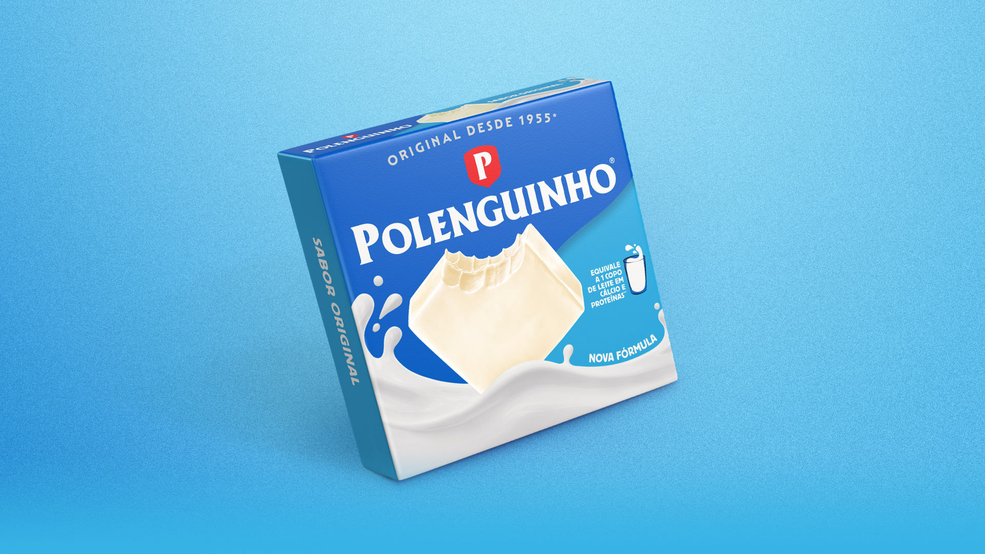
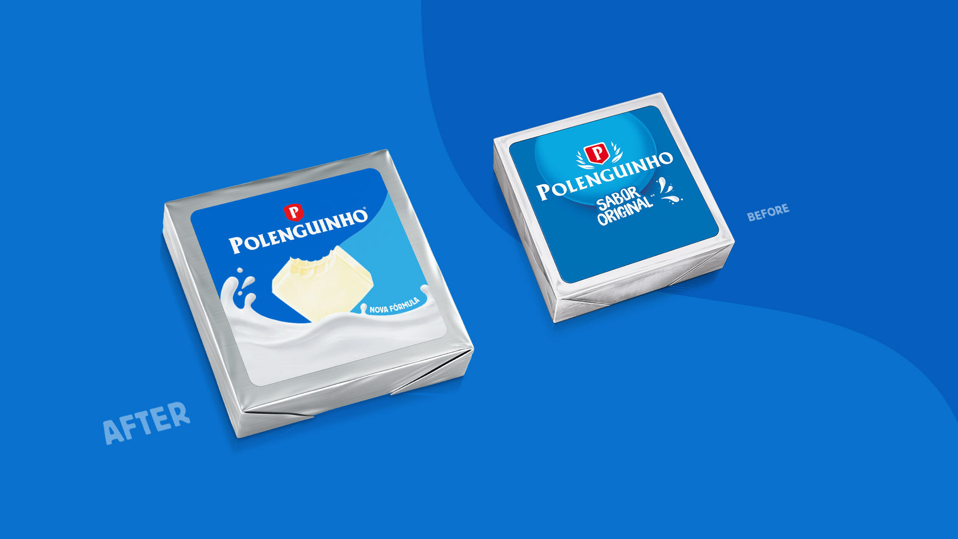
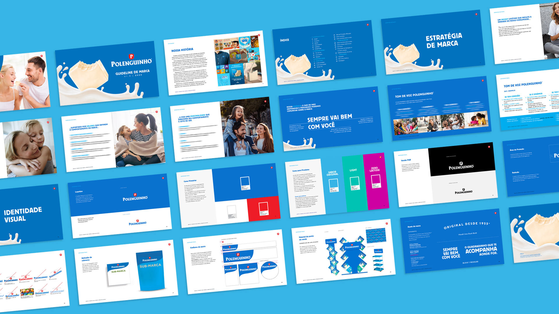
Trouxemos o posicionamento à vida renovando sua identidade. No tom de voz e no estilo fotográfico, procuramos valorizar as conexões, mostrar mais sorrisos, e dar água na boca. Nos elementos gráficos, ressaltamos a pureza e nutrição do leite, combinado ao sabor inconfundível do quadradinho. O novo design das embalagens, por fim, facilita o entendimento dos diferentes formatos e sabores da família Polenguinho através um novo sistema de cores.
Polenguinho: um projeto em que fomos responsáveis pelo reposicionamento, estratégia, identidade visual, tom de voz e embalagens.
Após meses de imersão, criamos territórios - baseados nas necessidades dos consumidores e nos pilares da marca - que foram avaliados em pesquisa para chegar em um posicionamento poderoso e assertivo. “Sempre vai bem com você” é a nova essência da marca que destaca sua versatilidade e seu companheirismo único: Polenguinho vai com você aonde for e quando der vontade. É o afeto de quem está sempre ao seu lado. É o equilíbrio entre nutrição e sabor, que te faz sentir bem.
Trouxemos o posicionamento à vida renovando sua identidade. No tom de voz e no estilo fotográfico, procuramos valorizar as conexões, mostrar mais sorrisos, e dar água na boca. Nos elementos gráficos, ressaltamos a pureza e nutrição do leite, combinado ao sabor inconfundível do quadradinho. O novo design das embalagens, por fim, facilita o entendimento dos diferentes formatos e sabores da família Polenguinho através um novo sistema de cores.
Polenguinho: um projeto em que fomos responsáveis pelo reposicionamento, estratégia, identidade visual, tom de voz e embalagens.
[EN]
We were faced with a big challenge – to reposition one of the most beloved brands in Brazil, improving the connection with its audience, attracting new consumers and designing a clear strategy to guide its evolution.
After months of immersion, we created territories – based on consumers' needs and on the brand pillars – and we assessed them in research to achieve a powerful and assertive positioning. “Always by your side” is the new brand essence, that highlights the brand’s versatility and unique companionship: Polenguinho is there for you wherever and whenever you want. It offers the special care of those who are always by your side. It balances nutrition and taste, making you feel good.
After months of immersion, we created territories – based on consumers' needs and on the brand pillars – and we assessed them in research to achieve a powerful and assertive positioning. “Always by your side” is the new brand essence, that highlights the brand’s versatility and unique companionship: Polenguinho is there for you wherever and whenever you want. It offers the special care of those who are always by your side. It balances nutrition and taste, making you feel good.
We brought the new positioning to life by refreshing the brand identity. We defined a tone of voice and photographic style that value connections, show more smiles, and are mouth-watering. The graphic elements emphasize the purity and nutritional value of milk, combined with the unmistakable flavor of the Polenguinho square. Finally, the new packaging design makes it easier to understand the different formats and flavors of the Polenguinho family through a new color system.
Polenguinho: we were responsible for the strategy, visual identity, tone of voice, and packaging of the brand repositioning.
Polenguinho: we were responsible for the strategy, visual identity, tone of voice, and packaging of the brand repositioning.


@CBA Latam Project Team
Design & Branding team
Luis Gustavo Bartolomei, Carolina Barruffini,
Fernanda Varnum, Laércio Parolo & Luciano Semeria
Print production
Melissa Schiffini & Anderson Oliveira
Design & Branding team
Luis Gustavo Bartolomei, Carolina Barruffini,
Fernanda Varnum, Laércio Parolo & Luciano Semeria
Print production
Melissa Schiffini & Anderson Oliveira
Account management
Marcella Mota & Karen Enumo
Marcella Mota & Karen Enumo
A L L R I G H T S B E L O N G T O P O L E N G U I N H O® A N D C B A B + G