@ CBA B+G + Luciano Semeria and Carina Benitez. All rights belong to D-Marin and CBA B+G.
D-Way: expertise and trust.
D-Marin is part of the Doğuş Group, one of the largest private-sector conglomerates in Turkey operating in different sectors (banking, automotive, construction, tourism, among others) with a portfolio of 250 companies present in 30 countries and 4 continents. D-Marin was created to set a new benchmark in operations in marinas worldwide and is today one of the largest international chain of marinas in the Eastern Mediterranean and the Gulf region that promotes recreational yachting.
Since D-Marin started operations, in 2003, it has been expanding and diversifying through partnerships and acquisitions. The growth in businesses required a new brand positioning and visual image to unify the design system and brand expression.
—
Creative Principles
—
—
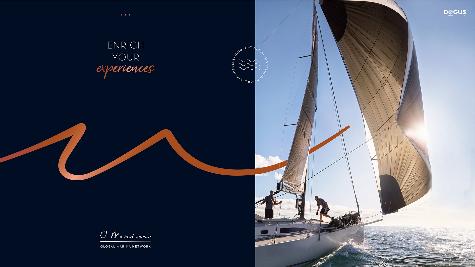
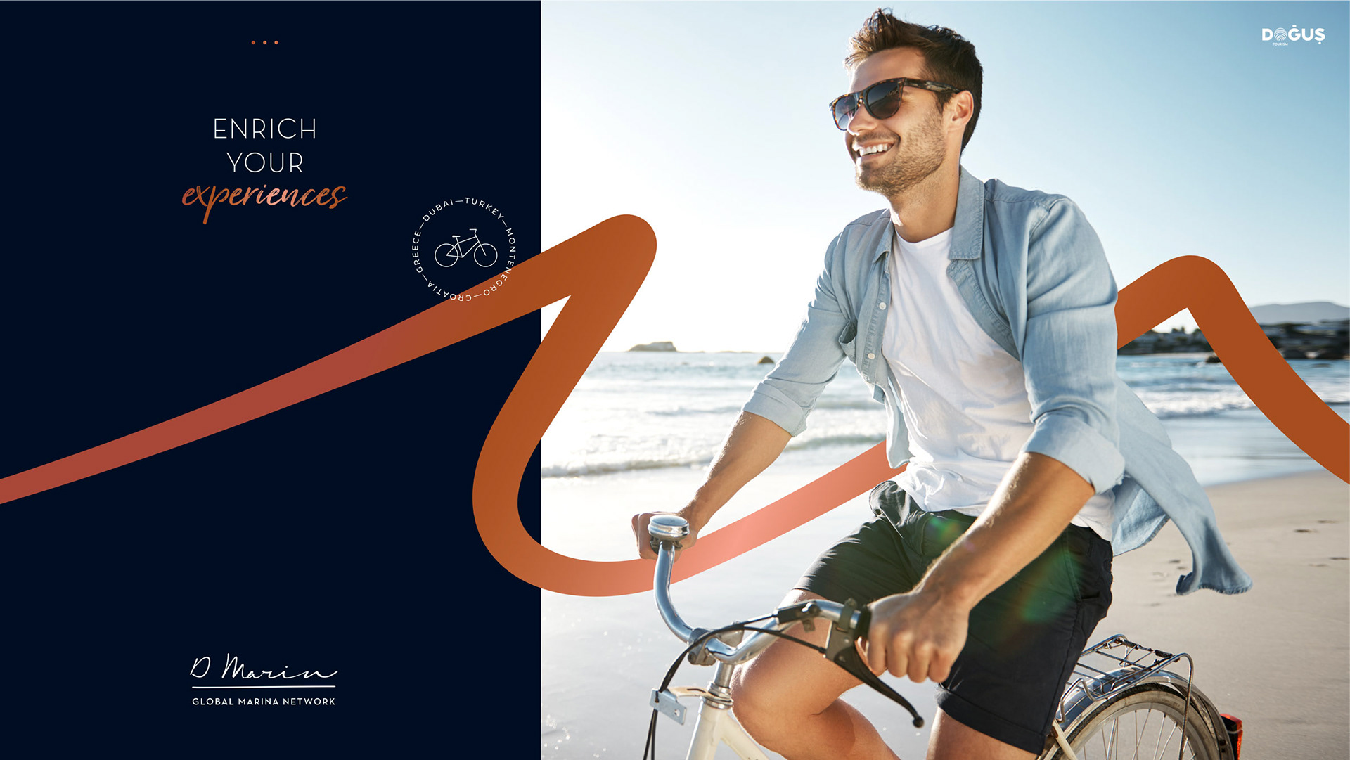
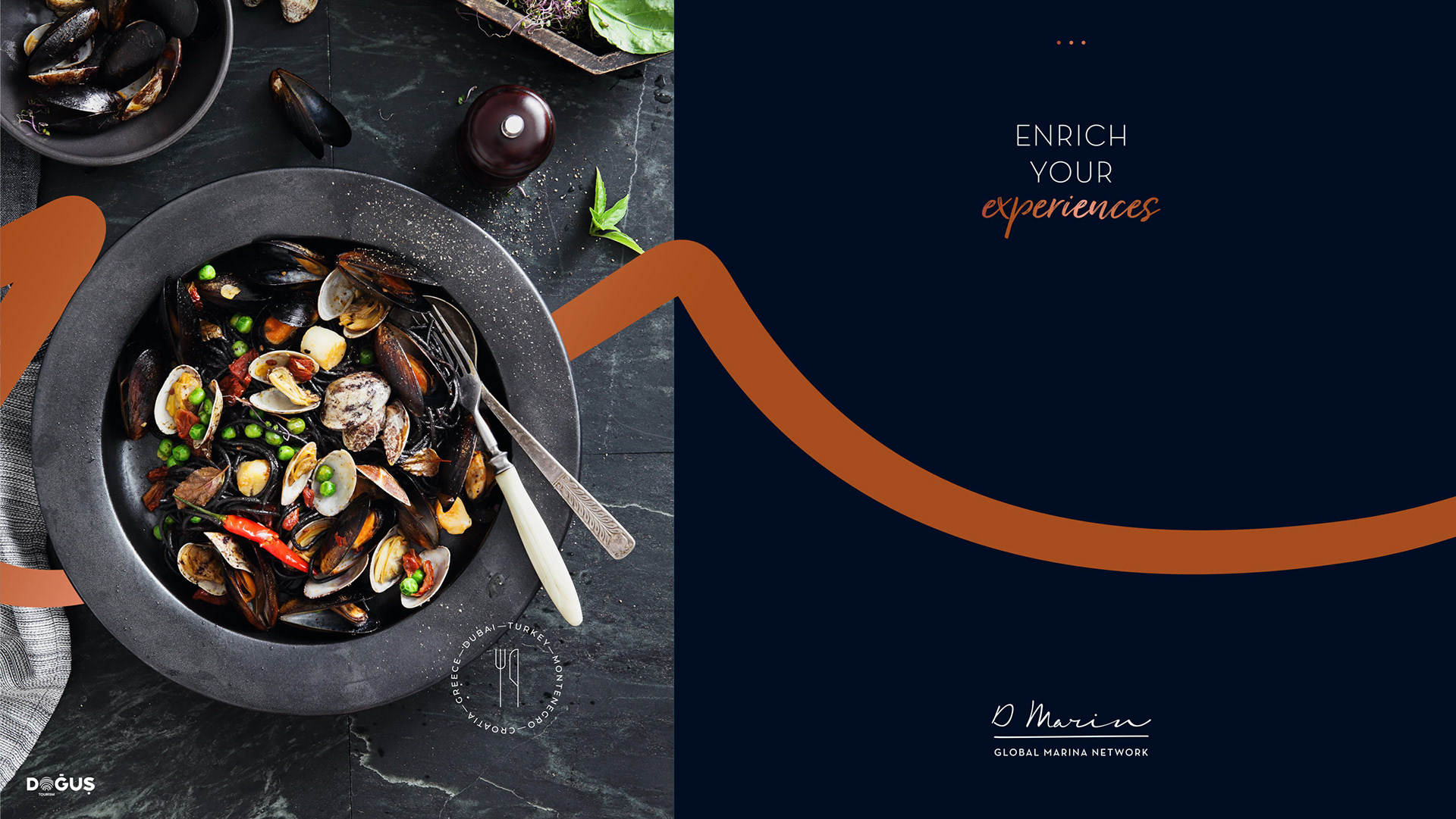
Enriching experiences.
—
We’ve covered a long way to enhance and reposition the brand. We started our journey internally, interviewing several employees, mainly in Greece, Turkey, Croatia and Dubai. We carried out a competitor analysis to understand what they offer; we studied the nautical category and the target segmentation to identify their habits and needs. To develop a unique value proposition for the brand, based on the results of the research as well as on the Group’s future vision, we applied CBA’s brand pulse methodology to define the company’s values and pillars and translate them into brand expression.
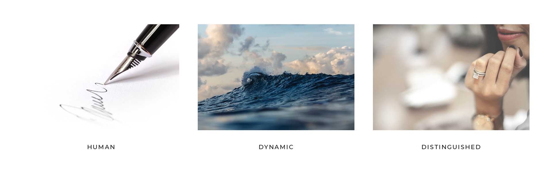
To represent D-Marin’s essence, we enhanced its core values, such as expertise and its renown commitment in offering reliable, safe and caring nautical experiences with irrefutably dynamic and quality service. These values are the backbone of what the company calls D-Way, a unique stand-out approach to business.
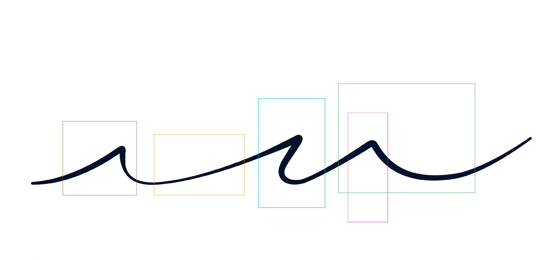
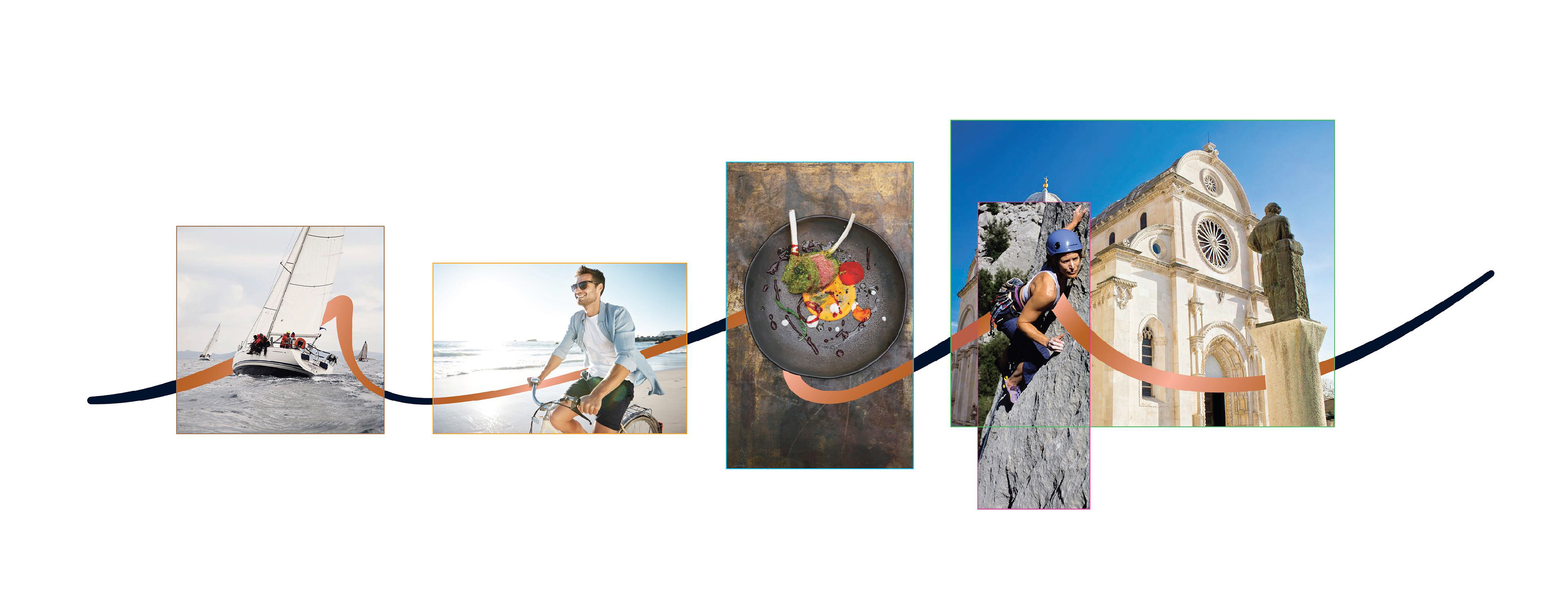
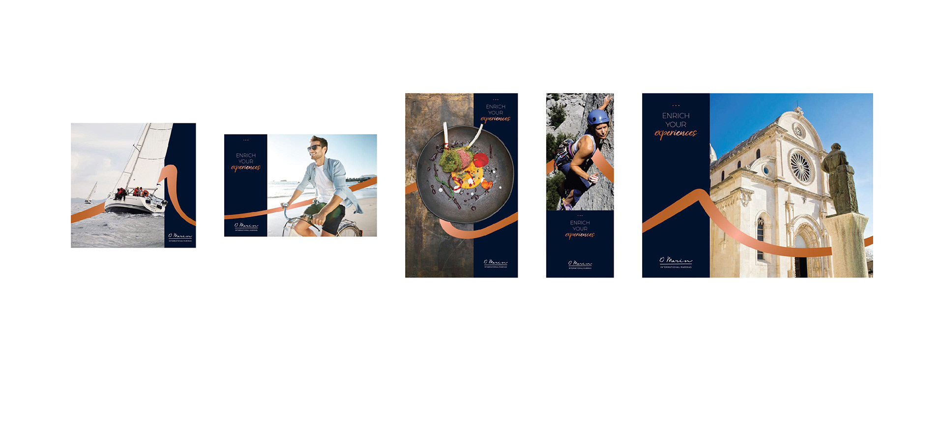
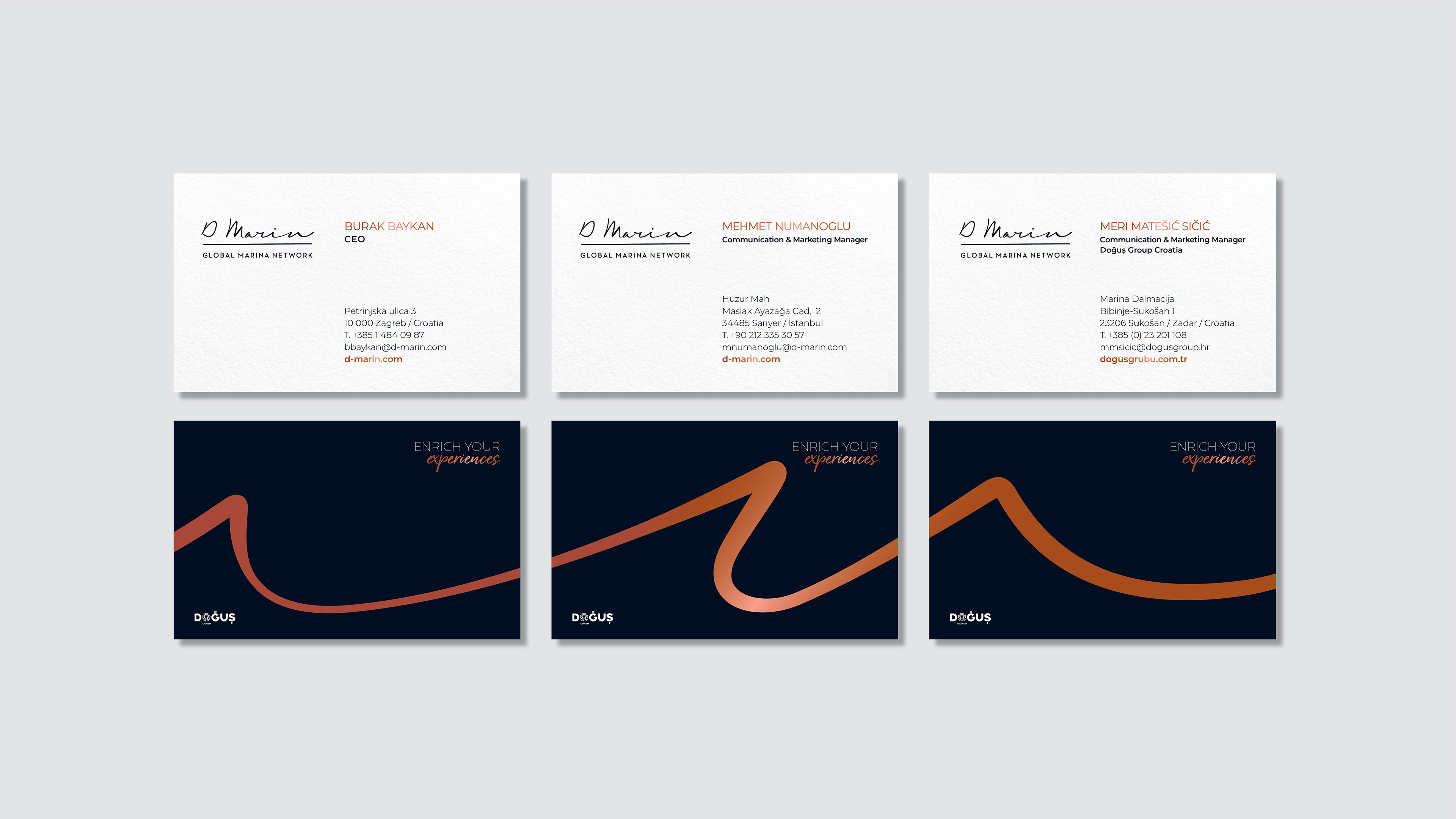
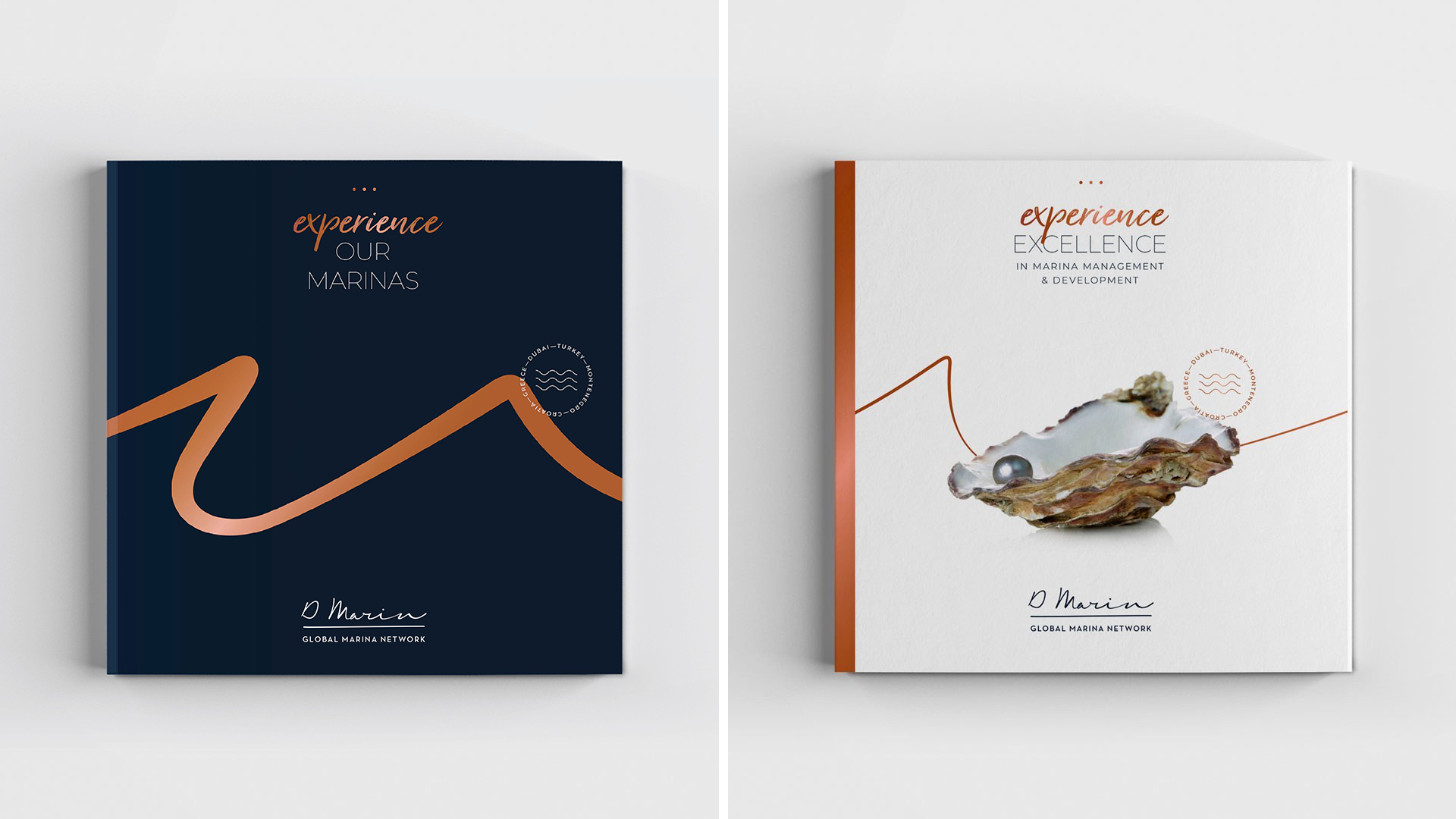
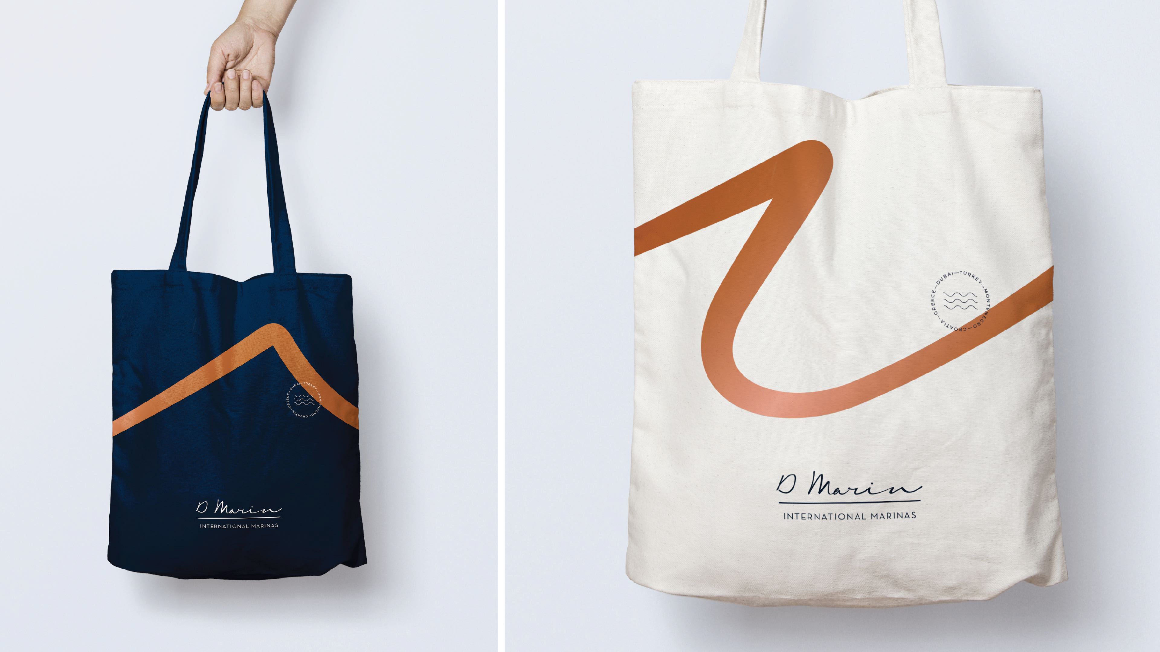
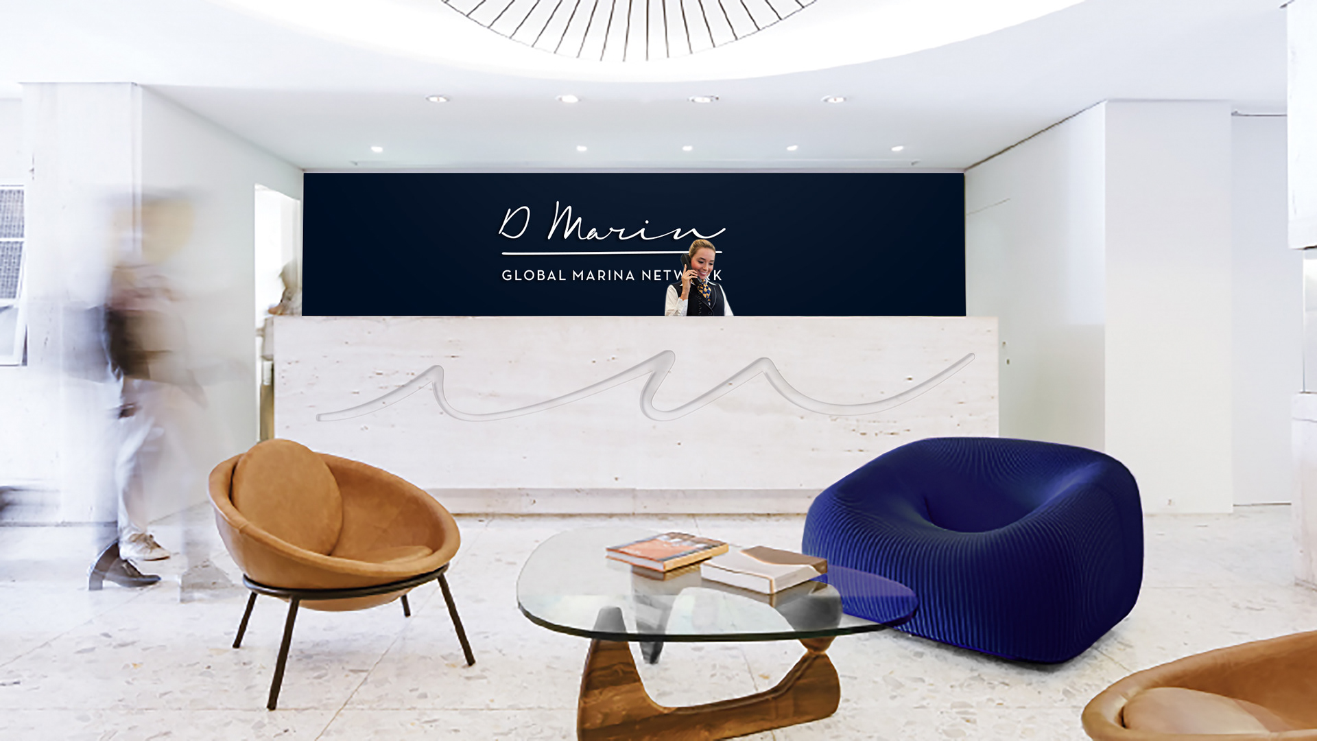
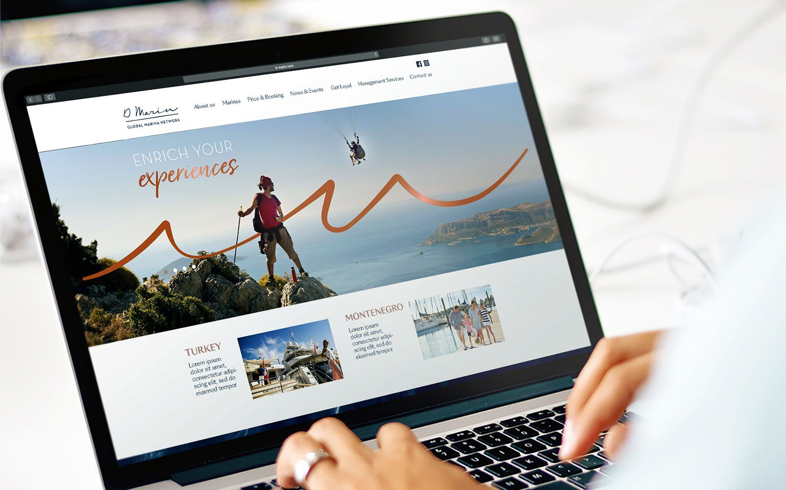
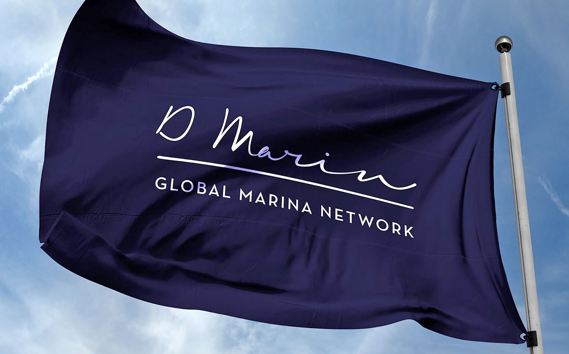
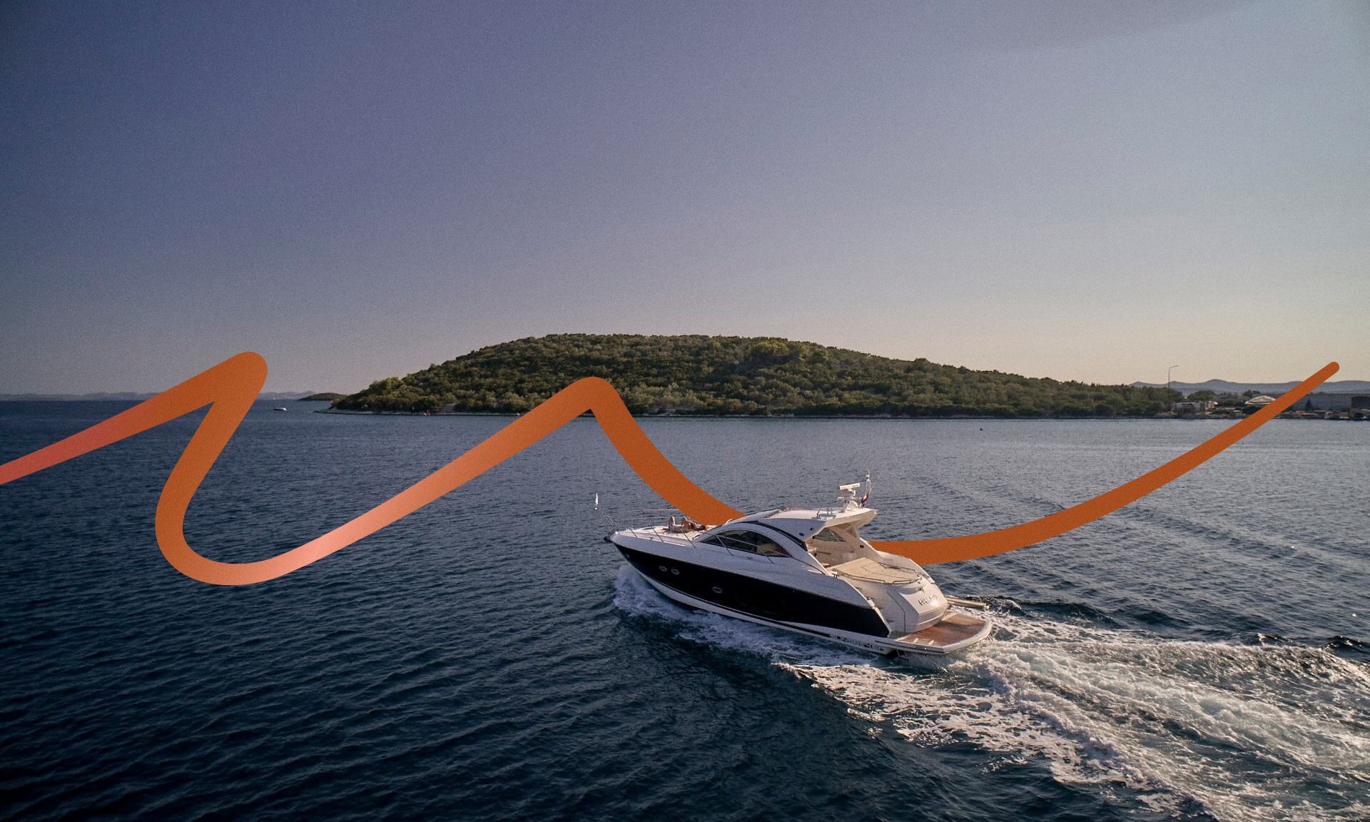
After defining the values and translating them into a consistent brand platform, we outlined D-Marin’s visual identity. The D-Way, enhanced by the company’s personality – inspiring an oversea vision, is human oriented and conveys the image of a reliable partner. Elegance, performance, dynamism and a handmade touch set the tone for the creation of the brand expression. The logo was modernised and the navy blue, a commonplace color in marines, was replaced by a different, warmer shade of blue, representing the human side of the company. The typography followed the same concept, in handwritten style.
Following these principles, we designed a consistent visual identity system for the brand, with instructions on how to apply the guidelines to all communication material, on and off-line, from the graphic materials to the uniforms and website, helping D-Marin to grow globally using the same tone of voice and image.